The 4 px Grid: A Tiny Foundation for Big Designs
Most design systems choose a baseline multiplier—8 px, 10 px, or 12 px. VDMX opted for a 4 px spacing base to achieve finer granularity while keeping the visual rhythm tight. This approach enables precise alignment of UI elements without sacrificing flexibility.
Setting Up the CSS Variables
:root {
  --space-1: 4px;
  --space-2: 8px;
  --space-3: 12px;
  --space-4: 16px;
  --space-5: 20px;
  --space-6: 24px;
  /* ... continue as needed */
}
All margins, paddings, and gutters reference these variables, ensuring uniform spacing across components.
Responsive Breakpoints Aligned with the Grid
We define three main breakpoints that respect the 4 px unit:
- Mobile – up to 599 px (spacing multiples of 8 px).
- Tablet – 600 px to 1023 px (spacing multiples of 12 px).
- Desktop – 1024 px and above (spacing multiples of 16 px).
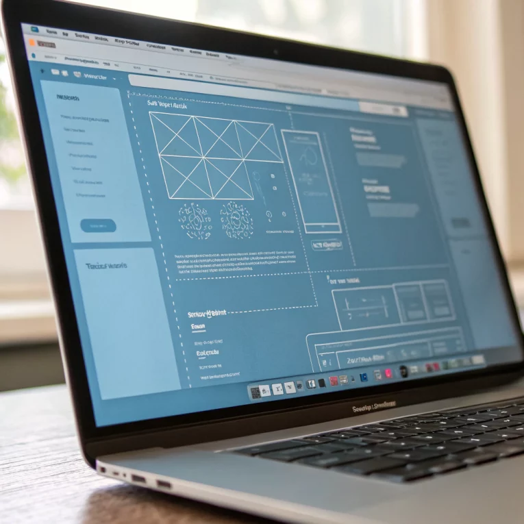
Practical Layout Example: Hero Section
Using the grid, the hero’s container has padding: var(--space-6), the headline uses margin-bottom: var(--space-5), and the call‑to‑action button sits with margin-top: var(--space-4). When the viewport shrinks, media queries adjust the variables, preserving the proportional feel.
Component Consistency
All reusable elements—cards, carousels, accordions—inherit the spacing system. This eliminates the need for ad‑hoc tweaks and reduces CSS bloat.
Benefits of the 4 px System
- Precision – Designers can align icons, text, and images to exact points.
- Scalability – Adding new components does not break the rhythm.
- Performance – Fewer custom CSS rules mean quicker page loads.
- Accessibility – Consistent whitespace improves focus navigation and visual scanning.
Testing the Layout
Use Chrome DevTools device mode and the “fit‑to‑grid” plugin to verify that every element snaps to the 4 px baseline. Look for any stray margin or padding values that aren’t multiples of 4.
Real‑World Success: VDMX Services Carousel
The carousel cards now share gap: var(--space-4), and each slide’s inner content respects the same spacing rules, resulting in a sleek, balanced appearance on all devices.
Conclusion
A 4 px spacing foundation may seem modest, but it unlocks a level of precision that scales effortlessly. Adopt this grid to achieve a harmonious, responsive design that feels intentional on every screen.

 using WordPress and
No responses yet